
A few weeks ago, just for fun I started doing concepts for a faux Justice League CG movie. I've always been a huge fan of Bruce Timm and the DC Timmverse he helped create, and I thought it would be cool to basically design the JLA movie that I would direct if given the chance. I didn't do any huge drastic changes because I didn't want to betray the characters in terms of who they are and what they're about. I just wanted to build on what's already been established and tweak things the way I saw them. I was going to wait until I had more artwork before I posted this, but with all the freelance I've got, I don't think I'll be able to work on this again for a while.
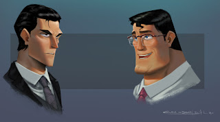
Clark and Bruce face shots: This pic is kinda what started the whole thing. I always thought Bruce Wayne and Clark Kent were a great opportunity to play with contrast. They both have similar features in a broad sense (Caucasian, black hair, relatively good looking) but I don't think they need to be drawn to look the same! These characters couldn't be more different, and so I tried to play that up with the shape language used in their design. I made Bruce primarily out of triangular shapes to associate him with danger, and I made Clark mostly out of chunky block shapes to emphasize a sense of protectiveness (which I think is what Superman is all about). I rounded the corners off on Superman's "blocks" to make sure the shapes were still comfortable and friendly.
I also made Bruce slightly more pale than Clark because I feel like it emphasizes the lack of warmth and is another way to appropriately add contrast to the characters.

Superman: Superman is a wholesome, good-natured guy with antiquated notions of heroism, and that's what I like about him. He represents a more honest hero, and SO many people don't like him because he's too corny, or not badass enough, and I think that's ridiculous. I hardly touched his costume at all because I wanted him to look corny and I wanted his image to reflect the dated quality of his beliefs. I really don't like when people try to make him like, this dark, violent, angry guy just for the sake of making him cooler.
Anyway I tried to make him primarily out of chunky square shapes, and I went as far as taking away the angles on his boots to make them a little more chunky and plain. I think he should be a big character to emphasize the fact that he's all about IMMENSE power and protectiveness. I know a lot of people say that he shouldn't be big because nothing would give him a workout, but I disagree because
1) Every time I see him lift something, he looks like he's straining real hard. Whether it's a car, a piece of rubble, a building, it all seems to be difficult for him.
2) The design reflecting the spirit of the character is more important to me than whether or not he'd be big in real life. He's powerful and he's protective, that's what I want my design to emphasize.

Green Lantern: I thought it would be cool if his outfit was more of a manifestation of the ring's power as opposed to just cloth. I think that's the angle the live action movie is taking too, so I thought I'd do my version of that idea. I thought it would be cool if the green parts were constantly shifting, and seemed like you were looking inside some kind of unstable, nebulous energy reaction. I went with the spots because I was paying homage to that swiss cheese effect that Jack Kirby used to do whenever he drew energy.

Wonder Woman: I went with angry, warrior, man hating Wonder Woman. I feel like if you're raised your entire life immersed in bigotry, you're not just going to change your beliefs after a single adventure. It's not gonna be like "oh these guys fought with me to save the world, men aren't so bad." Nobody just drops prejudiced opinions like that, they skew and distort things to keep supporting and maintaining their discrimination. I feel like her acceptance of men would be a very slow, gradual thing and it would never be 100%. I was mostly inspired by Darwyn Cooke's design with some tweaks here and there where I thought it made more sense or would add some appeal.

Batman: I wanted Batman to be composed of triangular shapes to emphasize how dangerous he is. I also didn't want to draw him big and bulky because in my version he's primarily an acrobat, not a bodybuilder. He's constantly doing flips and jumping off rooftops, so he'd be extremely lean. I also gave him the more armored costume because
1) It looks cool
2) Having an outfit that looks more like protective gear while everyone else is wearing more "costume-y" outfits visually reinforces the fact that he's human and mortal. It reminds us that he NEEDS this to protect him and that's a trait that I (and I think most people) like about batman.
I also made Batman's skin even more pale here than in the Bruce Wayne pic to further emphasize the lack of warmth in Batman, and it also helped to add more contrast against the darkness of his suit. I like the idea of his face being that one little speck of pale, cold, humanity peeking out from this huge enveloping shroud of darkness.

Scenes: These were (relatively) quickly done pieces to give an idea of mood, lighting, and color. I'm not 100% happy with all of them, but for the most part I like how they turned out. More than the other stuff, I wish I had time to do more of these. I feel bad that Green Lantern (black guy) is the only character who doesn't have one, but I was going to do another set of 3 with Hawkgirl, Green Lantern, and Flash. Maybe I still will.
